Community events
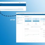
To ease the adoption and maintenance of events I redesigned the feature guided by known customer pains.
Tools: Adobe XD, InVision
Client: ArcGIS Hub, Esri
My Role: User Interface Designer, 2018

My contributions
- Worked with Product to understand the current and desired experience. The ‘create event’ flow offered layout customization, but that also allowed customers to override important information and added the burden of designing the page. We worked to simplify the process and make the end result attractive without the need for page design skills.
- Evaluated ArcGIS Hub’s event feature and presented improvement opportunities to stakeholders. As someone new to the product who has also attended a lot of events, low-hanging fruit that would significantly improve the experience was easy to spot.
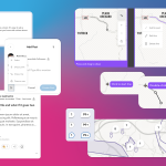
- Iterated on ‘live’ (attendee view) and ‘edit’ (configuration view) user interfaces. The team replaced the page-building engine with a templated layout that was also mobile-responsive. I also advocated for a quick way to switch between live and edit views so creators could confirm any edits in the end result.
Omg. I LOVE the new events. I’m finally getting it. Seriously, I really like how its all so integrated now. And the event pages look super slick.
– Lucy C.
Detailed case study
Email me for the password to access a deeper dive into:
- problems
- opportunities
- updates released
- my reflections

